ShopDreamUp AI ArtDreamUp

Deviation Actions


Suggested Deviants


Suggested Collections


You Might Like…


Featured in Groups


Description
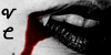
Just a little something I did to change my journal's header. This will be updated when I get the better idea for the background and details... Any ideas?
The original pictures is HUGE and I plan to add more family members, a background and who knows what!
Voyevoda (c) me
The Dysfunctionals family (c)

The original pictures is HUGE and I plan to add more family members, a background and who knows what!
Voyevoda (c) me
The Dysfunctionals family (c)
Image size
2128x1316px 264.37 KB
Comments36
Join the community to add your comment. Already a deviant? Log In
Ok, I just wrote a 1700 word critique on this, and I was almost finished when my computer blacked out. I am going to retype it in a bit shorter form. For this I am sorry.
My suggestion for the background would be something creepy <img src="e.deviantart.net/emoticons/m/m…" width="29" height="15" alt="
Thank you for putting the download option - that makes my job a lot faster, more throw and overall a lot easier.
Moving on to the drawing it self: The colors you chose are perfect - 10/10 no need to change anything. Though I think the blood should be a bit more vivid/red or at least outlined in a stronger red - to it would get more attention. You do not have to do this, but I think it deserves more attention because I have NEVER, ever I mean NEVER seen blood dipping from a flute - it is so original! A big + in originality from me.
Next. The anatomy: When I first looked at the drawing I thought the hands were too close, then I decided to look for reference images. I found one that is almost perfect for comparison: [link] I compared it bit by bit and it seems the hands are quite ok, and everything else for that matter except his right arm (the one closer to the viewer). The forearm is alright but the upper arm is under the wrong angle (do you see what I mean?) - just remember that once you lift his arm a bit you will have to draw his back line. This will probably easy to correct because the arm is mostly covered with the cloth (more about the cloth later on). Now that I have studied the hands a bit more the anatomy is really ok but they do posses a certain lack of outline. The shadow placement is quite good but put a bit more work into them and it will really be the finest eye candy. Feel free to put a bit more detail into the flute and I would advise to make the shiny areas smaller and give the flute a bit darker shadow on the lower side of the flute, perhaps even darker then the one you used on the upper side of the flute.
![[link]](https://www.deviantart.com/users/outgoing?http://en.wikivisual.com/images/b/b2/Flute_player.jpg)
I have to say that perhaps some of the advice I will give you can not be used on a digital drawing because I am quite inexperienced when it comes to this. Once again sorry, because of this I will look at it from a painter`s point of view - if you know what I mean.
One of the things I am really impressed with is the way you drew his shirt/cloth - especially the colors and the shades. For the fury parts I would suggest grouping the hairs to flow in one direction/style and giving them a small shine, also I noticed you used hazy moments (I do not know how else to describe them) to draw the fur - surprisingly they look good I think they will look even better if you draw out smaller hairs every now and then to make it more fur like even when it is zoomed and make it a masterpiece. You can do this manually or you can use some hair brushes (or even mix it, a bit manual and a bit of the brushes)these are my fav -> [link] I have a few more sets for hair I can link you those too if you want, but I usually resort to using this one. The rest of the cloth is great the way it is. Once again I compliment you on the use of colors and shades.
What I said for the fur goes for the hair as well, I am under the impression that he should posses silky, soft hair and a bit of brush work on-top of what you did so far and it will be excellent! I would also recommend that you add a bit more shine to his hair. I like his hair cut - it suits him both as a musician and as...a raper (ok, I can not believe I said that<img src="e.deviantart.net/emoticons/r/r…" width="29" height="27" alt="
I love how you did his face, I think his chin (and the blood on it) and nose are superb! The expression reflects a magical feeling "The Calm Before The Storm". Great job! I would put more detail on his hears and perhaps give them a more round or a more edgy look because they don`t seem to be swinging to either side - if you get what I mean. I am not really getting the lips, but I have to admit that I have no clue what I would change - the best advice I can give you is to look at some reference images or if that is exactly what you want - leave it that way. <img src="e.deviantart.net/emoticons/s/s…" width="15" height="15" alt="
The overall feeling the image has is something I have the pleasure of seeing in most of your work - regardless of the theme, character, items, background, everything there is a sense of strong emotions that vary with each piece, but what is almost always present is with lack of a better and less used word - love. Though I also feel nervous and ready for action (as in ready to get to work on something) when I see this image.
Once it is finished I think it will overwhelm every viewer that has a soul.
I am going to rewrite and post a critique on this again once it is finished.